One of the benefits of running short-form experiments with MobLab is the immediate availability of the results output. These graphs & tables can be used as launching points for class discussions, as students see their data, transactions, and strategies in real-time. How can you use these results in your class? In this blog post, we cover a fun way to guide students through theory and data in a sequential presentation of the results.
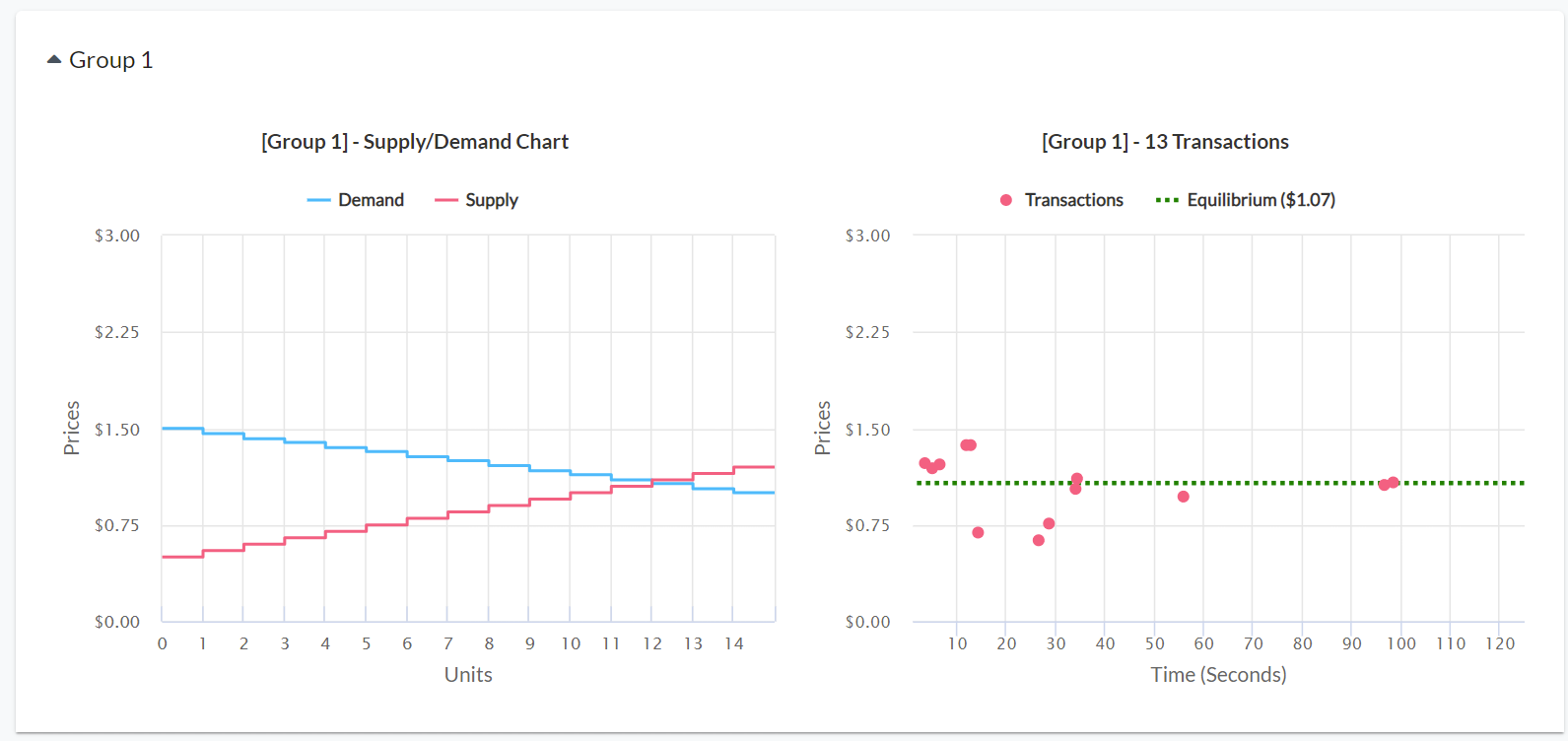
Let’s use our Competitive Market game as an example. Upon opening the results after gameplay, you will be presented with graphs, tables, and raw data. These different groups represent each market of students. Under the graphs tab, there are two outputs for each market.
The graph on the left depicts the demand & supply curve, set by you in the game configurations. This economic data game comes with default parameters that work just fine with most classes, but you can customize these to hone in on your learning objectives by throwing in a price floor, buyer’s tax, or non-linear curves! The graph on the right shows actual transactions that occurred in the market, and how they relate to the intersection of supply & demand (Figure 1).
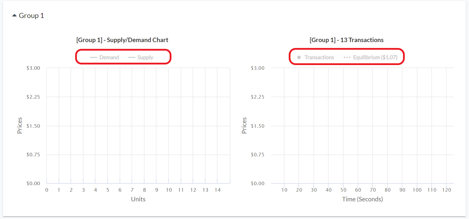
You are able to add & subtract pieces of information by selecting each item in the legend. By highlighting this data sequentially, you control what is revealed to the students step-by step, and can guide the conversation to that ‘Aha!’ moment. Start with a discussion about the left hand graph, and probe the buyers and sellers about their values/costs. Eventually the intersection of these two curves lead to an equilibrium price. Ask students where they think the equilibrium price is for that market. Who are buyers & sellers competing against? Why do these curves slope downward/upward? Figure 2 below shows the results output with all information hidden.
Tips from a MobLab instructor on how they reveal the data:
Select the buttons in the legend for these two graphs to hide all of the lines. Reveal the market demand curve. Ask students what it represents and ask them to provide reasons why it slopes downward. Reveal the market supply curve. Ask students what it represents and ask them to provide reasons why it slopes upward. Reveal the equilibrium price line. Ask students to explain why it is an equilibrium. If students simply give a textbook response, probe them about the game. Often buyers start out submitting stingy bids and sellers hold out for high prices. Across time, sellers must undercut each other to find willing buyers. Buyers must bid up over each other to find willing sellers. This pattern of adjusting their bids & asks shows the invisible hand at work! Is the equilibrium price-quantity pair a good prediction? Reveal the transaction markers. This sequential presentation of the data helps review content and walks students to the prediction. Showcasing the data emphasizes economics as an empirical science. If you have multiple groups of students, this provides you with an opportunity to reveal the difference between markets.
Following gameplay and the results debrief, you can assess comprehension about the theory by using the survey tool: MobLab Surveys in Live Classes.
Would you like to learn more about our online economics games? Get in touch with our team. Click here to schedule a one-on-one demo meeting.
Let’s use our Competitive Market game as an example. Upon opening the results after gameplay, you will be presented with graphs, tables, and raw data. These different groups represent each market of students. Under the graphs tab, there are two outputs for each market.
The graph on the left depicts the demand & supply curve, set by you in the game configurations. This economic data game comes with default parameters that work just fine with most classes, but you can customize these to hone in on your learning objectives by throwing in a price floor, buyer’s tax, or non-linear curves! The graph on the right shows actual transactions that occurred in the market, and how they relate to the intersection of supply & demand (Figure 1).
You are able to add & subtract pieces of information by selecting each item in the legend. By highlighting this data sequentially, you control what is revealed to the students step-by step, and can guide the conversation to that ‘Aha!’ moment. Start with a discussion about the left hand graph, and probe the buyers and sellers about their values/costs. Eventually the intersection of these two curves lead to an equilibrium price. Ask students where they think the equilibrium price is for that market. Who are buyers & sellers competing against? Why do these curves slope downward/upward? Figure 2 below shows the results output with all information hidden.
Tips from a MobLab instructor on how they reveal the data:
Following gameplay and the results debrief, you can assess comprehension about the theory by using the survey tool: MobLab Surveys in Live Classes.
Would you like to learn more about our online economics games? Get in touch with our team. Click here to schedule a one-on-one demo meeting.